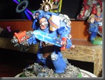
here the original

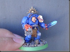
next a new one under daylight but no direct sunlight:

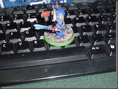
Next some more pictures :
All the pictures were taken under direct sunlight, here I must confess that up close the sword looks a bit bad but at table length it really looks good.


At a distance they look good but I don’t like the finish up close I might redo the sword to use blending instead of overbrushing, what do you think?

exelente se ve muy bien!!!se ve como q si la espada esta chispeando energia :p buen trabajo (postdata. ya estoy en guatemala a ver si nos juntamos a comer algo para mostrarte lo que llevo y como lo llevo)
ReplyDeletegracias hellboy veamos como estamos de horarios y nos juntamos lo mas seguro es que en 15 dias jugemos el torneito.
ReplyDeleteme apunto! yo llego maniana a guate asi que les puedo mostrar lo que llevo tambien :D
ReplyDeleteThe little shield looks even nicer in daylight but I think I figured out what bothered me about the sword and it is easily remedied. Take the outside for example. There are two squiggly lines, that represents electricity I assume, but they both face the same way. Adding 2-3 lines by maybe forking one and add one that has a different direction could do wonders. Because it is a nice power weapon, it just feels like it is swishing forward, needs a little balance:)
ReplyDeleteReminds me that all my power weapons look boooooooring. They need to be fixed up in the future :)
Thanks flekkzo i will try your advice
ReplyDeleteand re-post the pictures